JavaFX Flat Custom Windows - Part 3
July 16, 2016
Max / Min Buttons
The previous article added a window move function that allowed the user to reposition the custom window by dragging the title bar. The user can also resize the window by dragging from the lower-right corner of the window if running on Linux (Windows and the Mac do not provide resize handles on their UNDECORATED Stages). This article adds maximize and minimize buttons to allow the user to quickly resize or iconify the window.
Scene Builder
In the preceding articles, the title "Flat Win" was slightly off-center from the content "Content". Adding more buttons to the title bar makes this more apparent. A StackPane will be added that centers the title "Flat Win" to the contents and also pushes the buttons (including the close button) to the right.
This diagram shows the container structure of the finished app. As before, the entire title bar is wrapped in an HBox. However, instead of directly adding the next level of HBoxes -- containers for the title bar and buttons -- an intervening StackPane is added. This StackPane contains the HBox for the title bar (centered) and overlays the HBox for the buttons (right).
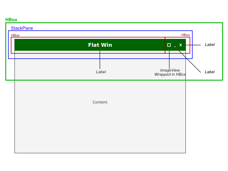
An ImageView is used for the maximize button because there is no suitable square character in the default fonts. That ImageView is wrapped in an HBox so that the same highlighting / hovering mechanism used for the close Label can be used for the maximize button. A border is not available to an ImageView, but one is available to an HBox.
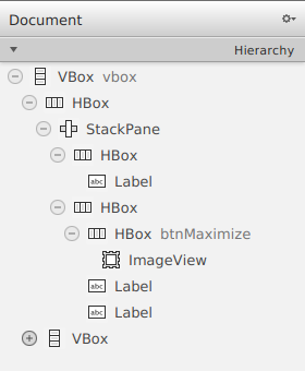
This image from Scene Builder presents the UI element structure in a tree format.
This is the procedure for adding the StackPane and new buttons.
- Open the resources/part3/start/FlatWin.html file in Scene Builder.
- Associate the stylesheet with the FXML by selecting Preview > Scene Style Sheets > Add a Style Sheet. Navigate to resources/part3/start/fw.css.
- Expand the first HBox in the Hierarchy Tab.
- Shift-select the pair of lower-level HBoxes, right-click, and select Wrap in > StackPane.
- Select the newly-added StackPane.
- In the Layout Tab, set Hgrow to ALWAYS.
- Expand the StackPane.
- Select the first HBox under the StackPane which contains the title.
- Under the Properties Tab, set the Alignment to CENTER (if not set already).
- Select the second HBox under the StackPane which contains the close button.
- Under the Properties Tab, set the Alignment to CENTER_RIGHT.
- Set the Spacing to 8 on the Layout Tab for the HBox.
This fixes the problem with the earlier versions that did not properly center the title to the contents. Next, add the controls for the new buttons: the maximize HBox/ImageView pair and the minimize Label.
- From the Controls Tab, drag a Label into the second HBox (the one that contains the close button Label).
- From the Controls Tab, drag an ImageView into the second HBox.
- Right-click on the ImageView and select Wrap in > HBox.
- In the Hierarchy Tab, make the HBox containing the ImageView the first child.
- In the Hierarchy Tab, make the close Label the last child.
It can be difficult to adjust the order. Control / Command + X will undo the operation if a control is moved to the wrong container. These steps configure the minimize button.
- Select the new Label (the one that is not the close button). Under Text in the Properties Tab, put an underscore character ("_").
- With the Label still selected, give it the CSS Style Class "min-button" in the Properties Tab.
- Open the Code Tab. Under On Mouse Clicked, set the method to "minimized".
These steps configure the maximize button.
- Select the HBox containing the ImageView.
- In the Properties Tab, add an fx:id of btnMaximize to the HBox.
- Give the HBox, the style class of "max-button" in the Properties Tab.
- Set the Alignment to CENTER.
- Open the Code Tab. Under Mouse Clicked, set the method to "Maximize".
- Select the ImageView.
- In the Properties Tab, use the Image browser to locate resources/part3/start/bkcourse_flatwinapp_max_icon.png.
- In Layout Tab, set the Fit Width to 0 and the Fit Height to 0.
CSS
CSS will provide the hover style which will show which of the buttons is about to be activated.
- Open sources/part3/fw.css in the IDE.
- Add the .min-button style class to the font styling of the title and the close-button classes.
.title, .close-button, .min-button {
  -fx-font-family: Arial;
  -fx-font-weight: 700;
}
This style prevents a glitchy resizing from occurring now that there are more buttons in the HBox. Borders are always present on the buttons, but they are hidden when unselected by blending into the background color. The hover will make the border white.
- Replace the current .close-button and .close-button styles with the following.
  .close-button, .min-button, .max-button {
    -fx-font-size: 12px;
    -fx-padding: 1px;
    -fx-border-color: darkgreen;  /* "invisible" border */
    -fx-border-size: 1px;
    -fx-border-style: solid;
}

.close-button:hover, .min-button:hover, .max-button:hover {
   -fx-border-color: white;
   -fx-border-size: 1px;
   -fx-border-style: solid;
}
Run the app or select Control/Command+P in Scene Builder to see the hovering action.
Code
The next steps modify the controller code to do the maximize and minimize operations. The minimize function is straightforward: a simple call to the Stage.setIconified(true) method. Recall that both the minimize() and maximize() methods were linked to the FXML in previous steps.
Add this to the part3.start.FlatWinController class.
    @FXML
    public void minimize(MouseEvent evt) {

      Stage stage = (Stage)((Label)evt.getSource()).getScene().getWindow();

      stage.setIconified(true);
    }
The maximize function allows the user to maximize the screen and also resizes the windows to its pre-maximize dimensions. The button works like a toggle, switching between full-screen and the last remembered dimensions. Add the following to the top of the controller to record the pre-maximized dimensions.
    private double lastX = 0.0d;
    private double lastY = 0.0d;
    private double lastWidth = 0.0d;
    private double lastHeight = 0.0d;
Finally, add the following method to the controller. Note that there is a Stage.maximize() function that could be called as was done with setIconified(). However, this did not seem to work as expected, so the dimensions are set and saved.
    @FXML
    public void maximize(MouseEvent evt) {

      Node n = (Node)evt.getSource();

      Window w = n.getScene().getWindow();

      double currentX = w.getX();
      double currentY = w.getY();
      double currentWidth = w.getWidth();
      double currentHeight = w.getHeight();

      Screen screen = Screen.getPrimary();
      Rectangle2D bounds = screen.getVisualBounds();

       if( currentX != bounds.getMinX() &&
         currentY != bounds.getMinY() &&
         currentWidth != bounds.getWidth() &&
         currentHeight != bounds.getHeight() ) {

         w.setX(bounds.getMinX());
         w.setY(bounds.getMinY());
         w.setWidth(bounds.getWidth());
         w.setHeight(bounds.getHeight());

         lastX = currentX;  // save old dimensions
         lastY = currentY;
         lastWidth = currentWidth;
         lastHeight = currentHeight;

       } else {

         // de-maximize the window (not same as minimize)

         w.setX(lastX);
         w.setY(lastY);
         w.setWidth(lastWidth);
         w.setHeight(lastHeight);
      }

      evt.consume();  // don't bubble up to title bar
    }
This code will check the current window against the dimensions of a maximized window. If they are equal, the operation will size the window to the last saved size (lastX, lastY, etc). Otherwise, the screen dimensions are used and the pre-maximized dimensions are saved.
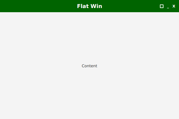
This is a screenshot showing the finished project.
For some projects, the off-the-shelf Stage class will suffice. Projects not concerned with branding or styles will not need extra code for basic windowing functions. However, to make an application look more professional and to reinforce branding and styling, use a custom Stage as in this series.
Series Links

By Carl Walker
President and Principal Consultant of Bekwam, Inc