Vue.js CSS Class Binding Demo
March 2, 2019
Vue.js can adds expressions to the class attributes of your HTML5 elements. These dynamic values can be paired with a static class attribute to produce more readable code. The reader is able to see all of the CSS classes affecting an element and won't have to interpret a separate Javascript method. This article shows an Accordion UI component built from ul elements and Vue.js.
An Accordion UI control is a navigation component that allows the user to expand or collapse content to manage what could be a large list. This article has several top level Category elements. Expanding a Category displays a list of Items. Collapsing the Category hides the Items; this is the initial state. The selections aren't exclusive and several items can be expanded at one time.
This video demonstrates the control. Selecting the Category headers shows and hides the underlying lists.
HTML
The project can be built by hand and doesn't use Vue CLI. There is a single HTML file "index.html".
This is a Vue.js port of a w3schools example "How TO - Collapsibles/Accordion". The CSS styling is repeated from the site.
index.html
<!DOCTYPE html>
<html>
  <head>
    <meta charset="utf-8" />
    <title>Toggle Class Example</title>
    <link rel="stylesheet" type="text/css" href="styles.css" />
  </head>
  <body>
    <div id="app"></div>
    <script src="https://cdn.jsdelivr.net/npm/vue/dist/vue.js"></script>
    <script src="main.js"></script>
  </body>
</html>
The body references the element for the Vue app instance, Vue library, and the main.js script holding the Vue app instance. There is a styles.css reference in the header.
Vue.js
The HTML supporting the Accordion is stored in the template field of the Vue app instance. The state of the Accordion is managed by three variables: showCategoryA, showCategoryB, showCategoryC.
main.js
const app = new Vue({
  el: "#app",
  data: {
    showCategoryA: false,
    showCategoryB: false,
    showCategoryC: false
  },
  template: `
    <div class="categoryBrowser">
        <ul>
            <li>
                <button class="accordion"
                    :class="{ active : showCategoryA }"
                    @click="showCategoryA = !showCategoryA">Category A
                </button>
                <ul class="category-list" v-show="showCategoryA" >
                    <li>Item #1</li>
                    <li>Item #2</li>
                    <li>Item #3</li>
                </ul>
            </li>
            <li>
                <button class="accordion"
                    :class="{ active : showCategoryB }"
                    @click="showCategoryB = !showCategoryB">Category B
                </button>
                <ul class="category-list" v-show="showCategoryB">
                    <li>Item #100</li>
                    <li>Item #200</li>
                </ul>
            </li>
            <li>
                <button class="accordion"
                    :class="{ active : showCategoryC }"
                    @click="showCategoryC = !showCategoryC">Category C
                </button>
                <ul class="category-list" v-show="showCategoryC">
                    <li>Item #9001</li>
                    <li>Item #9002</li>
                    <li>Item #9003</li>
                    <li>Item #9004</li>
                </ul>
            </li>
        </ul>
    </div>
    `
});
This screenshot shows the UI and the Vue app instance when no items are expanded.
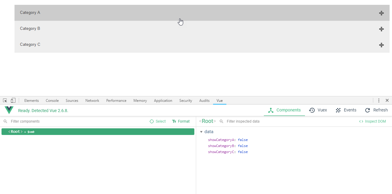
Because showing and hiding elements is so common, Vue.js provides a special directive v-show. This is applied to the child lists of Items. Initially, all three variables are set to "false". This makes v-show false through binding and gives the element a "display: none" style. When a value is set to true, the corresponding v-show evaluates to true and the "display: none" is removed.
This example presents three very similar blocks of code. This is for demonstration purposes to emphasize the styling. A real-world solution would factor out the common HTML into a single component and manage the differences in a data structure. For instance, there might be an array called "categories" that includes a show flag and a list of child items.
To change the viewable state of an Items list, there is an event handler attached to the buttons. The @click is shorthand for v-on:click. Rather than invoke a method, I've opted to put that trivial variable toggle in the click attribute. A click on the button will assign the corresponding variable the inverse value (true if false or false if true).
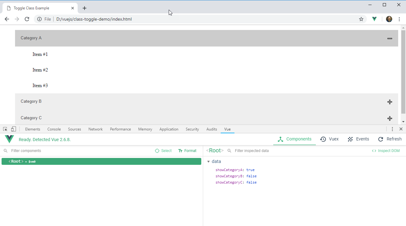
Each button is statically styled with an .accordion class selector. These apply the basic shape and coloring to the buttons. The dynamic component of the style -- when the button is made active and showing the contents -- is managed in the :class attribute. This is shorthand for v-bind:class. The expression "active: showCategoryA" will add the active CSS class to the element if the showCategoryA value is true. This will be the same for the other categories. The resulting list of classes on the button class attribute will be "accordion" plus or minus "active".
This screenshot shows the UI and Vue app instance when one of the items "Category A" is expanded.
CSS
This CSS was taken from the w3schools page listed earlier. It's using a .accordion style for all the buttons. Those buttons deemed active will get an additional .active style. The CSS uses the :after psuedoclass to set some the content of the button control. A + character is displayed on each button. This is overridden as a - if the active class is set.
.categoryBrowser ul {
  list-style-type: none;
}

.category-list > li {
  padding: 1em;
}

.category-list > li:hover {
  text-decoration: underline;
}

// from https://www.w3schools.com/howto/howto_js_accordion.asp
.accordion {
  background-color: #eee;
  color: #444;
  cursor: pointer;
  padding: 18px;
  width: 100%;
  text-align: left;
  border: none;
  outline: none;
  transition: 0.4s;
}

.active,
.accordion:hover {
  background-color: #ccc;
}

.accordion:after {
  content: "\02795"; /* Unicode character for "plus" sign (+) */
  font-size: 13px;
  color: #777;
  float: right;
  margin-left: 5px;
}

.active:after {
  content: "\2796"; /* Unicode character for "minus" sign (-) */
}
While the Javascript to toggle a class isn't particularly complex, it does require jumping to a separate section of the program to understand which CSS classes are going to be applied to a given HTML element. Vue.js let's you bring expressions into your CSS class assigments and even provides a special directive "v-show" to clearly describe the intent of hiding and showing object on a web page.

By Carl Walker
President and Principal Consultant of Bekwam, Inc