Vue.js Tabs With Bulma
November 4, 2019
This article shows how to create a tabbed UI in Vue.js using the Bulma CSS framework. The UI is built dynamically off of a list of registered components marked as tabbed components. The tabbed navigation will highlight the active tab and swap in different components based on the selection.
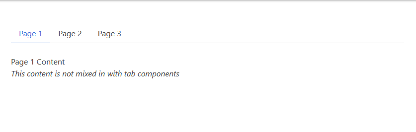
The UI in the screenshot below is divided into three parts. First, there is a list of tabs at the top: Page 1, Page 2, and Page 3. In the middle is the tab content. The current view shows Page 1 as the active tab -- as indicated by the underline -- and the Page 1 component is shown. The third part is extra content which verifies that the solution will work if there are more than just tabs registered with the parent component.
To try the navigation for yourself, visit this CodePen. Selecting the tabs across the top will mark the selection and substitute different component content in the middle of the screen.
See the Pen Vue.js Tabs With Bulma by Carl Walker (@walkerca) on CodePen.
Components
The demo contains a top-level app instance and four child components: Page1, Page2, Page3, OtherComponent. All four are simple, single-element templates. Page1, Page2, and Page3 contain a special tabLabel property. This will be used to display a preferred label (Page<space>1 instead of Page1) and a key for the v-for. Additionally, tabLabel will filter the tabbed components from the non-tab component "OtherComponent".
const Page1 = { tabLabel: "Page 1", template: "<p>Page 1 Content</p>" };
const Page2 = { tabLabel: "Page 2", template: "<p>Page 2 Content</p>" };
const Page3 = { tabLabel: "Page 3", template: "<p>Page 3 Content</p>" };

const OtherComponent = { template: "<p><em>This content is not mixed in with tab components</em></p>" };
The start of the app instance is presented next. An outer section holds a container. The container includes the tabs, a dynamic component (more later), and OtherComponent.
new Vue({
  el: "#app",
  template: `
<section class="section">
  <div class="container">
    <div class="tabs">
      <ul>
        <li v-for="c in tabComponents"
            :key="c.tabLabel"
            :class="{ 'is-active': currentPage === c }">
          <a @click="changePage(c)">{{ c.tabLabel }}</a>
        </li>
      </ul>
    </div>

    <component :is="currentPage" />

    <other-component />

  </div>

</section>
`,
The tab interface from Bulma relies on a single "tabs" class added to a <div> containing an unordered list. To show a selected tab, a class is-active is set on a list item.
Continuing with the app instance, this next block of code shows the component registration and the filtering of the tabbed components from the non-tab components. The components are registered using the components property. tabComponents is a computed.
  computed: {
    tabComponents() {
      return Object
        .values(this.$options.components)
        .filter(c => c.hasOwnProperty("tabLabel"));
    }
  },
  components: { Page1, Page2, Page3, OtherComponent },
The filter() checks each registered component which is available in this.$options.components. If the special property "tabLabel" exists, then it's eligible to be shown as a tab. The v-for in the HTML listing for the app instance uses tabComponents. "tabLabel" is used in the v-for's :key and as the displayed text for the hyperlink.
The remainder of the app instance listing is the data and methods supporting the tab selection. Referring back to the v-for, the is-active class setting is based on an object comparison of the current iteration ("c") and the currentPage data field. For the content of the screen, the Vue component directive is used with a dynamic :is set to the currentPage component object.
  data: {
    currentPage: Page1
  },
  methods: {
    changePage(pg) {
      this.currentPage = pg;
    }
  }
});
Each hyperlink is outfitted with a click handler that will change the current component. changePage() accepts an object as an argument and sets the currentPage field. Since currentPage is reactive, a change to it updates the :is attribute on the component directive. The UI shows the newly-selected page.
Bulma's tab interface couldn't be simpler. It's a single CSS class "tabs" made on a wrapping div. With Vue.js handling the dynamic behavior, the navigation is just a few lines of code, relying on %lt;component :is=""> to swap in changing content.

By Carl Walker
President and Principal Consultant of Bekwam, Inc