Vue.js Bulma Sticky Footer
February 22, 2019
This is an adaptation to a Sticky Footer implementation I found on CSS-TRICKS. The Sticky Footer will remain on the screen at the base of the page even if there isn't sufficient content to take up the middle portion. If there are several screenfuls of content, then the Sticky Footer won't be shown and instead will be displayed at the bottom of the last screenful.
Check out the original implementation here. Look for "flexbox".
This Sticky Footer implementation uses Flexbox. The key is to allow the main content container to take up remaining space with the flex-grow: 1 rule. Both the main content container and the footer are part of a container using Flexbox. This approach has the major benefit that the footer content is not fixed in size which could break as new content is added.
This example adds a variation that I use for Vue which is an outer wrapper. The CSS-TRICKS version applies the flex directives to the body element. However, your Vue code is likely wrapped in a single, top-level div. This article pushes that CSS-TRICKS body definition onto the div.
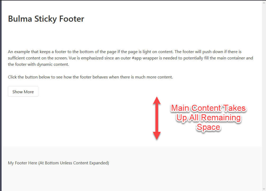
In the following screenshot, notice that the footer clings to the bottom. The main content pane has only two paragraphs and ends about at the midpoint of the vertical screen with a button.

Visit the following CodePen to see the Sticky Footer in action. Pressing the Show More button will add another 5 paragraphs of text, forcing the Sticky Footer off the screen to be viewed with the last screenful of data. This is shown when the user scrolls to the end.
See the Pen Vue Bulma Sticky Footer by Carl Walker (@walkerca) on CodePen.
This example adapted a CSS-TRICKS technique to Vue. Styles applied to the <body> element are pushed down to a <div> to accomodate a wrapper that will serve as the Vue app's el element.

By Carl Walker
President and Principal Consultant of Bekwam, Inc