Vue.js Modal With Bulma #1
November 3, 2019
This is a code example and walkthrough on how to create a modal dialog in Vue.js using the Bulma CSS framework. A modal dialog is a screen that superimposes itself on another screen, requiring the user to either interact with the dialog or to dismiss it.
In this demo, the user has pressed the button "Show Modal" and a small box is centered in the screen as shown in the following screenshot. There is a smoky, slightly opaque background that allows the user to see the launching screen. Showing the background gives the user context for the modal operation. The user won't feel they've navigated away from where they were working originally.
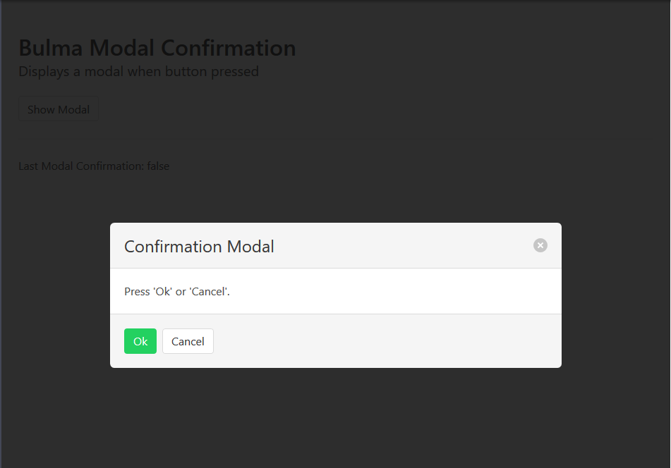
The following CodePen shows the modal in action. The main page lists the outcome of the modal. "true" is displayed if the Ok button on the modal was pressed. If the X button in the top right or the Cancel button is pressed, then "false" continues to be displayed.
See the Pen Vue.js Modal With Bulma #1 by Carl Walker (@walkerca) on CodePen.
Bulma
Bulma is a CSS-only framework. This means that any JavaScript needed to show / hide the modal or to record its outcome will be left to Vue.js. The Bulma modal is a <div> that displays the parameterized message and the buttons. Note that the modal <div> is always present in the HTML document. It will be shown or hidden based on a CSS class. These are the Bulma CSS classes used in this demo.
- modal - class for the outermost modal container
- is-active - paired with
modal, will show/hide the div - modal-background - provides the smoky, semi-transparent background of the non-content area
- modal-card - inner container of the modal's header, body, and footer
- modal-card-head - contains title and X close button
- modal-card-body - contains parameterized message content
- modal-card-foot - contains Ok and Cancel buttons
Vue.js
Vue.js launches the modal, closes the modal, and records the outcome. Several data fields are used as in the listing below.
    data: {
        showModalFlag: false,
        okPressed: false,
        message: "Press 'Ok' or 'Cancel'."
    },
showModalFlag is mapped to the is-active Bulma CSS class. When on, the class is activated and the modal is shown. When removed from the HTML, the modal is hidden. okPressed is a variable accessible by the modal. Pressing the Ok will set this variable to "true" en route to closing the modal. message supplies a custom message to the modal.
This is the syntax for linking the Vue.js showModalFlag value to a Bulma CSS class. If showModalFlag is true, then is-active will be included. Otherwise, the class will be omitted (and the modal hidden). Notice that I have both a static class attribute and a dynamic :class attribute. I could combine the two into one dynamic setting, but this is separated as a matter for style to keep the dynamic setting to the actual part that might change.
<div class="modal" :class="{'is-active': showModalFlag}">
Three methods are used. showModal sets showModalFlag and is called from the main screen's "Show Modal" button. okModal and cancelModal are called from the modal itself.
  methods: {
    showModal() {
      this.okPressed = false;
      this.showModalFlag = true;
    },
    okModal() {
      this.okPressed = true;
      this.showModalFlag = false;
    },
    cancelModal() {
      this.okPressed = false;
      this.showModalFlag = false;
    }
  }
This article presented a modal dialog using the Bulma CSS framework and Vue.js. Functionally, it works. However, there is room for improvement in terms of software maintenance. It's likely that a custom confirmation modal will be used in more than once place. Continuing with this article's approach, you'd cut-and-paste this code into the other areas and would sprawl into a maintenance problem. (The same code would need to be updated in multiple places.) Moreover, we may want to use a similar frame of modal in other contexts such as a complex Add form that displays UI controls instead of a simple text message. The next article in this series will show how the code can be refactored into a single location for reuse across an app.

By Carl Walker
President and Principal Consultant of Bekwam, Inc