Vue.js Reusable Address Subform
September 2, 2019
This article shows how to create a reusable address subform in Vue.js. The address subform will be used twice for billing and shipping sections. The form will be styled with Tailwind CSS and validated with VeeValidate. A CodePen is included demonstrating the form.
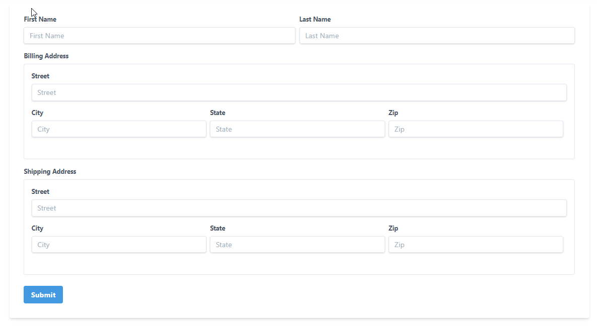
The following screenshot shows the target form. Contact information, say from a ecommerce checkout page, is gathered from the user. This includes first name, last name, and two addresses. The two addresses are for billing and shipping. Each address consists of street, city, state, and zip code.
This CodePen demonstrates the app. Filling out all the fields will enable the Submit button and you'll see a String rendering of the form in the Console. After touching a field, if you go back and remove the contents, you'll get an error indicating that the field is required.
See the Pen Reusable Address Subform by Carl Walker (@walkerca) on CodePen.
Internally, the app will be built with two Vue.js components: MyForm and AddressSubForm. MyForm contains the name fields and two instances of AddressSubForm. Each field -- whether in MyForm or an AddressSubForm -- will be wrapped in a Vee Validate ValidationProvider. The ValidationProvider will provide field-level validation throughout the form. An outer ValidationObserver (also from Vee Validate) will provide form-level validation that disables the submit button when any of the fields are not valid.
This SysML Block Definition Diagram shows the parts of the app. The App instance contains a component MyForm. MyForm contains two instances of the AddressSubForm component. MyForm also manages two properties itself: firstName and lastName. AddressSubForm has four properties: street, city, state, zip.
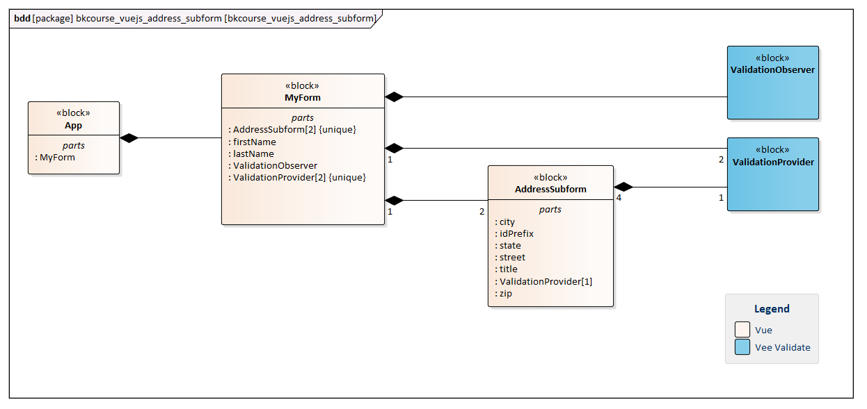
Each component contains a ValidationProvider instance for each field it manages. MyForm has two ValidationProviders (for firstName and lastName). AddressSubForm has four ValidationProviders (for street, city, state, zip). Recall that there are two AddressSubForm instances, so eight field/ValidationProvider pairs will appear on the form.
There is a ValidationObserver associated with the top-level MyForm.
AddressSubForm
The AddressSubForm component receives a pair of props from the caller (MyForm). These are title and idPrefix. "title" is used to give a header to the subform. This is an item that's displayed to the user so it can be capitalized or contain spaces. idPrefix is used to disambiguate the HTML of the Vue component and to provide for autofill.
Autofill uses "shipping" and "billing" as de facto names for address sections. More on this can be found on this Google blog.
There are four data fields that are v-model'd: street, city, state, zip. A change to any of them will trigger the updateField() function. That function will use the sync'd variable to form a payload. The payload is emitted back to the caller using "address-updated".
const AddressSubForm = {
  props: [ "title", "idPrefix" ],
  template: `
<div>
  <label v-if="title" class="block text-gray-700 text-sm font-bold mb-2">{{ title }}</label>
  <div class="bg-white border rounded p-4 mb-4">
      <div class="mb-4">

        <label class="block text-gray-700 text-sm font-bold mb-2" :for="idPrefix + '_street'">Street</label>
          <ValidationProvider name="Street Address" rules="required" v-slot="{ errors }">

        <input class="shadow appearance-none border rounded w-full py-2 px-3 text-gray-700 leading-tight focus:outline-none focus:shadow-outline"
                type="text"
                :id="idPrefix + '_street'"
                :name="idPrefix + '_street'"
                :autocomplete="idPrefix + ' street-address'"
                placeholder="Street"
                @input="updateField"
                v-model="street" />

            <span class="text-red-500 text-xs italic">{{ errors[0] }}</span>

        </ValidationProvider>
      </div>
     <div class="flex mb-4">

        <div class="w-1/3 pr-2">
          <div>
            <label class="block text-gray-700 text-sm font-bold mb-2" :for="idPrefix + '_city'">City</label>
          <ValidationProvider name="City" rules="required" v-slot="{ errors }">
            <input :for="idPrefix + 'city'" class="shadow appearance-none border rounded w-full py-2 px-3 text-gray-700 leading-tight focus:outline-none focus:shadow-outline" type="text" :id="idPrefix + 'city'" :name="idPrefix + '_city'" :autocomplete="idPrefix + ' address-level2'" placeholder="City" @input="updateField" v-model="city" />
          </ValidationProvider>
          </div>
        </div>

        <div class="w-1/3 pr-2">
            <div class="mb-4">
              <label class="block text-gray-700 text-sm font-bold mb-2" :for="idPrefix + '_state'">State</label>
          <ValidationProvider name="State" rules="required" v-slot="{ errors }">
              <input :for="idPrefix + '_state'" class="shadow appearance-none border rounded w-full py-2 px-3 text-gray-700 leading-tight focus:outline-none focus:shadow-outline" type="text" :id="idPrefix + '_state'" :name="idPrefix + '_state'" :autocomplete="idPrefix + ' address-level1'" placeholder="State" @input="updateField" v-model="state" />
          </ValidationProvider>
            </div>
        </div>

      <div class="w-1/3 pr-2">
          <div class="mb-4">
            <label class="block text-gray-700 text-sm font-bold mb-2" :for="idPrefix + '_zip'">Zip</label>
          <ValidationProvider name="Zip" rules="required" v-slot="{ errors }">
            <input :for="idPrefix + '_zip'" class="shadow appearance-none border rounded w-full py-2 px-3 text-gray-700 leading-tight focus:outline-none focus:shadow-outline" type="text" :id="idPrefix + '_zip'" :name="idPrefix + '_zip'" :autocomplete="idPrefix + ' postal-code'" placeholder="Zip" @input="updateField" v-model="zip" />
          </ValidationProvider>
          </div>
      </div>
  </div>
</div>
`,
  data() {
     return {
       street: null,
       city: null,
       state: null,
       zip: null
     };
  },
  methods: {
    updateField() {
      this.$emit("address-updated", {
        "street": this.street,
        "city": this.city,
        "state": this.state,
        "zip" : this.zip
      });
    }
  }
};
MyForm
MyForm is the main container for the web app. The Vue app instance is sparse, immediately calling MyForm in a render function. MyForm has a pair of fields of its own, firstName and lastName. These are v-model'd to data fields as the AddressSubForm ones. MyForm also maintains a pair of objects corresponding to the current addresses in the billing AddressSubForm and the shipping AddressSubForm. When an update-address event is sent, setBillingAddress() or setShippingAddress() will be called.
const MyForm = {
    template: `
<div class="container mx-auto">
<ValidationObserver v-slot="{ invalid, pristine }">
  <div class="bg-white shadow-md rounded px-8 pt-6 pb-8 mb-4 mt-4">

    <div class="flex mb-4">
      <div class="w-1/2 pr-2">
        <label for="firstName" class="block text-gray-700 text-sm font-bold mb-2">First Name</label>

          <ValidationProvider name="First Name" rules="required" v-slot="{ errors }">
            <input
              class="shadow appearance-none border rounded w-full py-2 px-3 text-gray-700 leading-tight focus:outline-none focus:shadow-outline"
              type="text"
              id="firstName"
              placeholder="First Name"
              v-model="firstName" />

            <span class="text-red-500 text-xs italic">{{ errors[0] }}</span>

            </ValidationProvider>
      </div>

      <div class="w-1/2">
        <label class="block text-gray-700 text-sm font-bold mb-2">Last Name</label>
          <ValidationProvider name="Last Name" rules="required" v-slot="{ errors }">
        <input class="shadow appearance-none border rounded w-full py-2 px-3 text-gray-700 leading-tight focus:outline-none focus:shadow-outline" type="text" id="lastName" placeholder="Last Name" v-model="lastName"/>
            <span class="text-red-500 text-xs italic">{{ errors[0] }}</span>
        </ValidationProvider>
      </div>
    </div>

    <address-sub-form title="Billing Address" @address-updated="setBillingAddress" idPrefix="billing" />
    <address-sub-form title="Shipping Address" @address-updated="setShippingAddress" idPrefix="shipping" />

    <div class="mt-6">
      <button :disabled="pristine || invalid" @click="submit" class="bg-blue-500 hover:bg-blue-700 text-white font-bold py-2 px-4 rounded focus:outline-none focus:shadow-outline" type="button">Submit</button>
    </div>

  </div>
</ValidationObserver>
</div>
`,
  data() {
    return {
      firstName: null,
      lastName: null,
      billingAddress: null,
      shippingAddress: null
    };
  },
  components: { AddressSubForm },
  methods: {
    setBillingAddress(payload) {
      this.billingAddress = payload;
    },
    setShippingAddress(payload) {
      this.shippingAddress = payload;
    },
    submit() {

      let printAddr = (addr) =>
        console.log(`  addr ${addr.street} ${addr.city}, ${addr.state} ${addr.zip}`);

      console.log(`submitting ${this.firstName} ${this.lastName}`);
      if( this.billingAddress != null ) {
        console.log("billing address:");
        printAddr( this.billingAddress );
      }
      if( this.shippingAddress != null ) {
        console.log("shipping addresss:");
        printAddr( this.shippingAddress);
      }
    },
  }
};
MyForm also contains the submit handler which will write the form out to the Console.
Other Setup
The CodePen has two JavaScript library Settings: Vue and Vee Validate. See the CodePen link at the top of this page to see the specific links and version.
There is some code that is at the top of the CodePen for initializing Vee Validate. Vee Validate Rules is a third dependency, but it's only available on the CDN as a module. So, I'm using the import statement. I'm providing an extension to the standard required rule that echos the field name in the error message. The ValidationObserver and ValidationProvider components are registered globally.
import { required } from "https://cdnjs.cloudflare.com/ajax/libs/vee-validate/3.0.3/rules.js";

VeeValidate.extend("required", {
    ...required,
    message: '{_field_} is required'
  });

Vue.component("ValidationProvider", VeeValidate.ValidationProvider);
Vue.component("ValidationObserver", VeeValidate.ValidationObserver);
The trivial App instance is listed below.
new Vue({
  render: h => h(MyForm),
  components: { MyForm }
}).$mount('#app')
This article showed a working example of how to create a reusable AddressSubForm using Vue and Vee Validate. If there were additional addresses required on the form, you'd add a new address-subform component in the HTML and provide a data field and setter to record the information. Vee Validate gives us an all-encompassing validation solution that hides the details of the subform validation yet makes the results available at the aggregate level for overall control of the form.

By Carl Walker
President and Principal Consultant of Bekwam, Inc