Working with Items in a TornadoFX ListView
June 5, 2018
This article demonstrates working with a ListView control in TornadoFX. The ListView control is backed by a Kotlin collection. The user can add items to the ListView using a two-TextField form at the base of the screen. There is a Delete Button for removing items. The Add and Delete Buttons are only enabled when there is data in the TextFields or a selected item in the ListView, respectively.
The following is a screenshot of the app
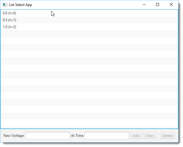
Three items have been added to the ListView which are pairs of voltage and time values: (0.0, 0), (0.5, 1), (1.0, 2). All the Buttons are disabled. Selecting an item will enable the Delete Button. Pressing the Delete Button will remove an item from the ListView and also display a confirmation Alert. Entering values in both the New Voltage and the At Time TextFields will enable the Add Button. Pressing the Add Button will add a pair of values to the ListView. The Clear Button is a convenience that will clear out the values both TextFields.
There isn't any validation on the New Voltage and At Time TextFields.
The contents of the ListView are Kotlin domain objects of type SensorData. These objects are outfitted with JavaFX properties. For this example, mapping the fields to JavaFX properties isn't important. However if a later requirement for updating the ListView contents is needed, manipulating the objects will also update the UI.
Code Listing
This is a listing of the SensorData class.
class SensorData(v : Double, t : Long) {
    val voltageProperty = SimpleDoubleProperty(v)
    var voltage by voltageProperty
    val timeProperty = SimpleLongProperty(t)
    var time by timeProperty

  override fun toString(): String = "$voltage (time=$time)"
	}
The next segment of the program to look at is a set of member variables that keep track of the application state. This includes the Kotlin list of initial SensorData objects as well as several properties that back the UI controls. This app has a single View and doesn't involve other classes like Controllers which would be found in larger programs. The member variables belong to the View class and can be bound to the UI controls and used in the action handlers.
class ListSelectView : View("List Select App") {

  val sensorReadings = mutableListOf(
    SensorData(0.0, 0L),
    SensorData(0.5, 1L),
    SensorData(1.0, 2L)
  ).observable()

  val selectedReading = SimpleObjectProperty<SensorData>()

  val newVoltage = SimpleStringProperty()
  val newTime = SimpleStringProperty()
The ListView is bound to a Kotlin list of observable SensorData. There is a property, selectedReading, which is the currently selected item. It can be empty. newVoltage and newTime are used to retrieve the values entered into the respective TextFields.
Bound properties -- in both JavaFX and TornadoFX -- are the mechanism by which changes in one part of the program automatically propagate to other parts of the program like the UI controls.
The ListView
The next section of code sets the root object of the View. The toplevel container is a VBox and the first item added is the ListView. The ListView is initialized with the previously-described sensorReadings object. TornadoFX can infer the type to be used for the ListView from this object. Within the TornadoFX Type Safe Builder, I bind the selectedItem (which can be null) and set a cellFormat. The cellFormat is used to render the two-value SensorData into a readable String.
  override val root = vbox {
    listview(sensorReadings) {
      bindSelected( selectedReading )
      cellFormat {
        text = "${it.voltage}V (t=${it.time}ms)"  // the toString() doesn't have units
      }
    }
TextFields and Button Actions
The user controls for altering the ListView data are in an HBox. The HBox contains two TextFields for gathering the pair of values needed to create a SensorData object: newVoltage and newTime. There are three Buttons supporting the three functional requirements of the application which are Add, Delete, and Clear. The Buttons contain action {} and enableWhen {} clauses. The action blocks implement the functionality while the enableWhen blocks help steer the user to valid selections.
  hbox {
    label("New Voltage")
    textfield(newVoltage)
    label("At Time")
    textfield(newTime)
    button("Add") {
      enableWhen { newVoltage.isNotEmpty.and(newTime.isNotEmpty) }
        action {
         sensorReadings.add(SensorData(newVoltage.value.toDouble(), newTime.value.toLong()))
        }
    }
    button("Clear") {
        enableWhen { newVoltage.isNotEmpty.or(newTime.isNotEmpty) }
        action {
          newVoltage.value = ""
          newTime.value = ""
        }
    }
    separator(Orientation.VERTICAL)
    button("Delete" ) {
      enableWhen { selectedReading.isNotNull }
      action {
        val obj = selectedReading.value

        sensorReadings.remove(obj)

        alert(Alert.AlertType.INFORMATION
          "Deleted",
          "Deleted ${obj.voltage} at t=${obj.time}")
        }
    }
    alignment = Pos.CENTER_LEFT
    padding = Insets(10.0)
    spacing = 4.0
  }}}
This example showed how TornadoFX separates the UI controls from the actions in an application. For data elements required by an operation (Add, Delete, Etc), you declare member variables that are JavaFX properties. The variables are bound to the UI control and automatically updated when the contents changes. For example, newVoltage is updated with the latest value in its corresponding TextField. Then, the later part of the program, say the Add operation, can use the values in an operation.
There's also an App subclass and main which be found in the source .zip referenced below.
Resources
The source code presented in this article series is a Gradle project found in the zip file below.
To run the demo, create an Application configuration in your IDE that will run the ListSelectApp class. In IntellIJ,
- Go to Run > Edit Configurations
- Select Application and press +
- Name the configuration
- Select the ListSelectApp.kt file.

By Carl Walker
President and Principal Consultant of Bekwam, Inc