Graphics In a Table Cell with TornadoFX
October 26, 2018
To render a field in a TableView, use the column{} builder. This renders as text based on the String value of the field. You can use the cellFormat{} builder within column to further customize the rendering. This article displays an enum value as a Shape, provides a conditional Tooltip, and considers a sibling field for the textual presentation.
This screenshot shows a TableView with records representing a collection of servers and their statuses. Status is based on an enumerated value (UNKNOWN, DOWN, SLOW, UP). I'm hovering over the last item (status=DOWN) to show that is has a Tooltip.
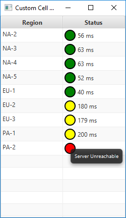
TableView with Status TableColumn Customized
The program starts with an enum and a domain object.
enum class ServerStatus { UNKNOWN, DOWN, SLOW, UP }

class Server(region : String, status : ServerStatus = ServerStatus.UNKNOWN, lastPing : Int) {
    val regionProperty = SimpleStringProperty(region)
    val statusProperty = SimpleObjectProperty(status)
    val lastPingProperty = SimpleIntegerProperty(lastPing)
}
regionProperty and lastPingProperty use their respective type-specific JavaFX Property subclasses. The ServerStatus enum, created just for this program, wraps up its value in a SimpleObjectProperty.
Next, I store my test data in a Controller subclass. This creates an ObservableList of Server records.
class CustomCellController : Controller() {
    val data = listOf(
            Server("NA-2", ServerStatus.UP, 56),
            Server("NA-3", ServerStatus.UP, 63),
            Server("NA-4", ServerStatus.UP, 63),
            Server("NA-5", ServerStatus.UP, 52),
            Server("EU-1", ServerStatus.UP, 40),
            Server("EU-2", ServerStatus.SLOW, 180),
            Server("EU-3", ServerStatus.SLOW, 179),
            Server("PA-1", ServerStatus.SLOW, 200),
            Server("PA-2", ServerStatus.DOWN, -1)
    ).observable()
}
The App has a single View. The View class injects the Controller and sets the Scene Graph root object. The root object is a TableView. Two columns are defined: Region and Status. Region is a single-line definition that uses the default textual rendering of the regionProperty value. Status has been customized with a cellFormat.
class CustomCellView : View("Custom Cell Demo") {

    val controller : CustomCellController by inject()

    override val root = tableview(controller.data) {

        column("Region", Server::regionProperty)

        column("Status", Server::statusProperty) {
            cellFormat {
                if( it != null ) {

                    val circle = Circle(10.0)
                    circle.stroke = Color.BLACK
                    circle.strokeWidth = 2.0

                    when(it) {
                        ServerStatus.UNKNOWN -> circle.fill = c("gray")
                        ServerStatus.DOWN -> circle.fill = c("red")
                        ServerStatus.SLOW -> circle.fill = c("yellow")
                        ServerStatus.UP -> circle.fill = c("green")
                    }

                    if( it == ServerStatus.UNKNOWN || it == ServerStatus.DOWN) {
                        text = null
                        this.tooltip = Tooltip("Server Unreachable")
                    } else {
                        text = "${this.rowItem.lastPingProperty.value} ms"
                        this.tooltip = null
                    }

                    graphic = circle
                } else {
                    graphic = null
                    tooltip = null
                    text = null
                }
            }
        }

        columnResizePolicy = CONSTRAINED_RESIZE_POLICY
    }
}
cellFormat begins with a null check. This code will also handle the display of empty cells. For empty cells, all of the fields that will be set for non-empty cells are cleared.
TableCells are recycled for performance reasons. While a new TableCell will have these values unset, this code can be called for a previously-rendered TableCell and the now empty record should render as such.
A Circle object is created and its fill is set based on the value of status. There is a special clause for UNKNOWN or DOWN that clears the text and sets a Tooltip. For records that are SLOW or UP, the text is set to a modified String value. (The modification is the unit addition "ms".) The Tooltip is cleared.
The App uses a trivial App subclass and main.
class CustomCellDemo : App(CustomCellView::class)

fun main(args: Array<String>) {
    launch<CustomCellDemo>(args)
}
It's very common to customize a TableCell. Where possible, you should use Type Safe CSS as in this article . However, if setting CSS doesn't give you enough customization, you can control the Node content of the TableCell. This example worked with three fields available in the parameters of cellFormat: text, graphic, tooltip. For a graphic-only rendering you can clear the text setting (text=null). "Graphic" is somewhat misnamed because it can actually be any Node and not just a Shape as in this case. A Hyperlink or a UI input control could have been added.

By Carl Walker
President and Principal Consultant of Bekwam, Inc